Interactive
Dashboard
Process
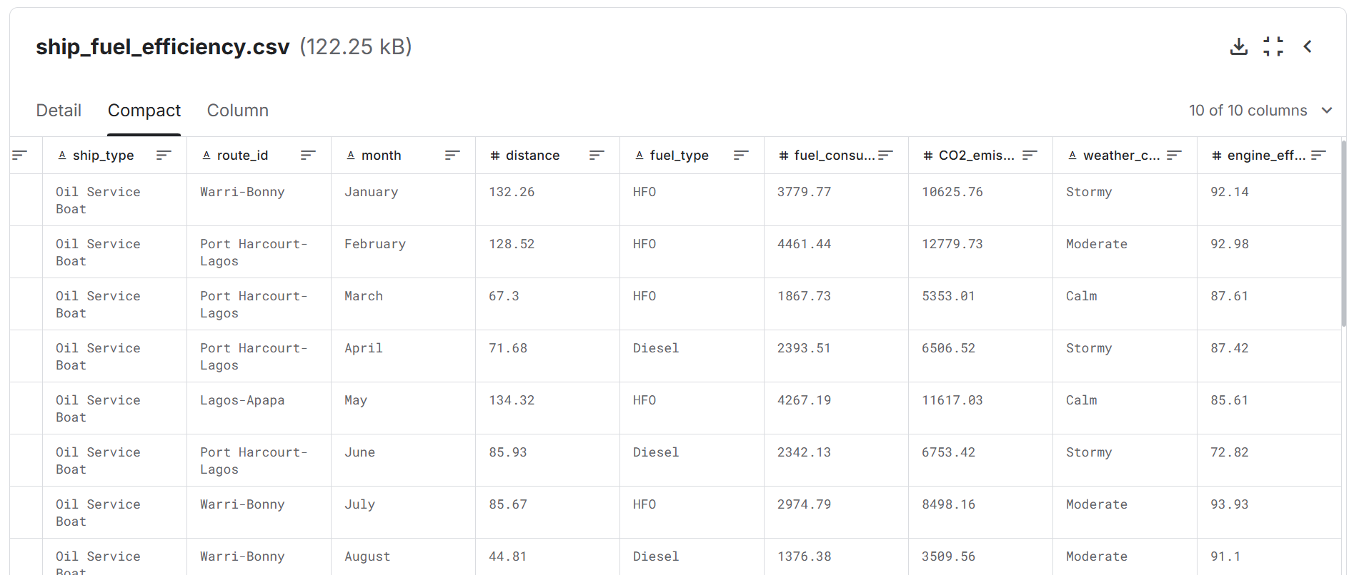
Data was sourced from the Ship Fuel Consumption & CO2 Emissions Analysis Dataset from Fijabi J. Adekunle on Kaggle. (Source)
Data manipulation was done using the Pandas library. The dashboard was made using Streamlit and Plotly.
Features of the dashboard include:
- A side bar with categorical filters
- Tabulated data, and Bar and scatter plots
- Highlight Figures (at the top of the dashboard)
Conclusion
I learned how to manipulate data and visualise components of a large dataset in an interactive dashboard. Using Streamlit, a web-based application was designed and deployed. Other libraries to explore for dashboarding include Panel, which supports Jupyter Notebooks.